Shift Happened - Part 2: Small Apps Loosely Joined

by Thomas Vander Wal in , , , , , , , , , , , , , , , ,


What are Small Apps Loosely Joined?

There has been a large shift in how many people work today and part of that is in the tools that they use to get work done. This shift in work patterns mirrors the shift that many had in their personal lives around social interactions and productivity.

Late one night many years ago (long before the iPhone), a group of us were talking about web and mobile and opportunities to work in a variety of similar tools that were all interconnected. The mash-up culture was a year or two behind us with Paul Radamacher’s first map mashup HousingMaps and the salient understanding that surfaced from that was the ability to have different interfaces for different needs and uses that could work as a workflow, or even similar interfaces for different personal needs of the users. We talked about Twitter and its heavy reliance on third-party developers to build web and mobile apps and services on top of its services and the Twitter API (the application programming interface, which is a standard data and interaction layer that sits behind the scenes bring data back and forth between the service). This approach allowed anybody to build an interface for seeing and interacting with Twitter or create an interface that provided greater ease of use for tasks. With tongue in-cheek (paraphrasing David Weinberger’s “Small Pieces Loosely Joined”), I said this model was small apps loosely joined.

What joined these apps together was a common data layer that fits a standard data model (or, as is common in APIs, a data model that self describes). The Twitter model allowed people to interact with the service through a mobile app with full functionality of the Twitter site, or to see many different Twitter lists in something like TweetDeck, or monitor and respond through different accounts in something like HootSuite, while tracking follows and drops in other monitoring services.

This same idea is more prevalent now across our mobile devices and the apps and services that they connect to and use. Not only are today’s mobile apps and services interacting with the APIs on the internet, but they are working with standard file formats on the backend and apps that meet the needs of users’ context and workflows. Some of the common app and service types that people have been shifting to the small apps loosely joined model are: Calendar, email, photos, text / documents, and to do lists / reminders (a closer look at these follows).

Who is Doing This?

The small apps loosely joined concept is nothing new in the technical geek and productivity nerd community (as part of both tribes, i use the words geek and nerd lovingly), as well as for early adopters. These uses and patterns with small apps loosely joined started surfacing around ten years on the web and mobile devices, all interconnected to the internet.

We understand innovation and broad adoption can take quite some time, roughly 10 years for innovations and new ideas to take hold broadly. We are about 10 years into this way of working and interacting with information and applications, so it was not exactly a surprise to hear research (done in-house to better understand the mobile market) that 60 to 70 percent of military members and their families surveyed use more than one app for a task types. They used calendars, email, and weather as examples. I checked with others who do surveys of employees inside organizations if they were looking at the question and found that they were. Their responses were also in the 60 to 70 percent range for calendar, to do, and text apps on mobile devices.

So, while this small app loosely joined focus and obsession within technology and productivity communities has been more than a decade old, it is something that is now rather mainstream. Over the last five years or so, when I am traveling or in a dank gym for club basketball, I often ask people next to me what apps and services they like the most on the mobile devices that is in their hand. Their answers often surface apps related to tasks and workflows for a data type (calendar, document, etc.) and the person would qualify how and in which circumstances they use it. Quite often, the app did one or two things really well that others didn’t cover or did not do well in their perspective.

Why are People doing this?

There are a lot of reasons why people started embracing small apps loosely joined. The primary driver has been mobility and looking for small mobile or tablet apps that do a specific, needed task. Mobile and tablet uses often have quite different contexts for use, including a mix of creation and consumption, but the affordances and agency in these apps is a driver too. Having applications work across platforms is helpful, but it is more essential to have open file formats and standards that work with apps that can pick up the file and provide use on another device with the constraints and augmented capability mobile and tablets provide.

There are additional relevant benefits of the file formats and standards working across devices. The ability to easily share files with others with whom you are working or communicating is a great benefit, as the platform doesn’t matter, just the ability to grab an app (often inexpensive and sometimes free) to read and modify the file is key. Being able to easily share files leads to always having needed files accessible, as they can be kept of an internet directory (the kids, okay grown-ups, call this cloud storage).

The last benefit that is driving people to the world of small apps loosely joined is the value of non-proprietary files, which isn’t as hippy and give-it-to-the-man as it sounds–it’s really about ensuring that the files will work on any device with an application that handles that type of object. Having to keep two or three versions of the same software around so one can work across file differences, or open files in a different version of the software so it can be saved down into an older version, is silliness we can leave in the inefficient old days. Many of the file structures that are based on around text, including calendars, can be opened in any text application and read and edited there.

Where are People Doing This?

Most people (particularly outside the geeks) started down this path when smartphones and the modern class of tablets entered their lives. They looked for ways to replicate how they worked on laptops and desktops, but often the same apps weren’t there and they had to improvise. Word of mouth also spread ideas and options for getting things done. But, often people go exploring small, focused apps that are inexpensive or free to see what they do. The small targeted apps, often in the “does one thing well” class of app or small app that is does a few things simply and easily, have filled made it easy to try quite a few different apps to find something that works. People often find a few apps that fit into a workflow that targets a few small tasks to get things done while standing in line, stuck in traffic, or sitting at your desk waiting for one’s computer to finish updating and reboot.

As a result, often people find that this small focused app model helps them do the things they need to do, and it can be more efficient than digging around large cumbersome software. Often this can be more efficient as the person is not digging around large cumbersome software. Once this becomes a habit or a way of working on mobile, the expectation is that it should also work on the desktop / laptop as well. People look for similar apps and services that fit their more efficient workflows that started on their “devices that are too small and limited to do any real work on” and want that same type of focussed application where they “do their real work”.

This change is also being driven by more than just shifts in devices–people are trying apps and services in their personal life to help manage their schedules or work simultaneously with club or event organizers crafting an email or newsletter. Our personal lives used to trail our work lives as far as technology and services
augmenting what we do, but now what we’re doing in our personal lives has greatly surpassed the capabilities of many of our work offerings.

The Types of Apps that Often Fit the Bill

The starting place for many people who try a variety of apps on their mobile and tablet devices are weather, text, and calendar. We don’t modify weather apps as they are mostly just a display of provided content, but there are much variety among the offerings, such as <give a good, standard example> and DarkSky, which offers micro-location weather with how many minutes until precipitation starts or stops.

Text apps

Text apps is where many start seeing the concept and value of small apps loosely joined. People want something more than just simple notes application to jot ideas and sync them to other devices. They want to be able to read and do a little editing of text that they or others started writing on their “work” devices, all while standing in line or during other available moments that permeate our day. Soon this “little bit of editing” seems like it isn’t all that bad to do and they start picking up things they started writing elsewhere and knock out more on their mobile device or tablet. Or, they have an idea when they are not near their “work” device and start jotting a few notes in a text app, and soon it has turned into a couple or few paragraphs. The accessibility and convenience of these capabilities has switched on a lightbulb. Talking and comparing notes with friends and colleagues, they find there are apps that are not just simple text, but can add annotations for structure (headers and outlines), hooks for style (bold and italics), and more. This often leads to learning that some apps have more robust writing tools (dictionary, thesaurus, writing analytics, etc.). Those who write with a workflow of first getting ideas out of their head and then working with them to hone them are often most prone to the small apps loosely joined way of doing things. But, others also like the ease of just getting words and ideas out in one app, then editing elsewhere by just opening another app and grabbing the same text file from a cloud sync service or sharing between apps directly. These text apps, particularly when those that are markdown friendly, can take that initial text and turn it into a styled PDF, a Word doc, HTML to post, RTF (rich text format), or more.

Calendar apps

Calendars are another gateway drug, er application type, that leads to embracing the small apps loosely joined way of doing things. The calendar files are a set file type that is easy to move from app to app (except when working across platforms that have proprietary hooks that break compatibility). Smartphones and tables all come with calendar apps, but they rarely fit the full range of needs. Some people want a calendar to have a certain look or layout format that helps them see and evaluate their day, and there is an abundance of options on all platforms for visual display. But, the real gems are the small apps that shine with certain tasks like Fantastical does on Apple products with its natural language parsing that turns spoken words into an almost always bang-on calendar entry.

Other calendar apps start adding other intelligence and agency (applications doing things on our behalf to ease our work). Donna (rest her digital soul) was a favorite of mine for evaluating time between events and different modes of transport and calculating time to leave based on weather and traffic conditions (and if you were really stuck in a jam, it offered to help you get Uber). Donna was a gem for the space between meetings, but was an incredible help with coordinating kid pick-up and leave times related to their various events. Other apps that are helpful agents are Tempo (it came out of the same SRI lab as Siri), which is one of the fullest featured and most helpful calendar apps around. Tempo monitors your mail not only for events, but pulls the relevant emails, documents, location and contact information, and relevant transportation needs into one simple calendar entry–and all you had to do was place it on your calendar or say yes to an event invite. Tempo offers the ability to send an “I’m running late” notification to those with whom you are meeting, as well as the expected arrival time.

One the the interesting things about calendars in the small apps loosely joined set is that most of these class of apps do something else–they augment and clean-up the calendar entry. Say I open Tempo and it doesn’t recognize the location that is in the calendar entry - say it only has Ray’s Pizza in NYC (oh, you too have gone down this crazy path of meeting somebody at Ray’s Pizza in NYC only to later realize (not soon enough) that there are more than one and nearly a billion permutations of Ray’s, Ray’s Original, Original Ray’s, etc.)… so Tempo offers suggestions to sort out the exact location and then enters the address in the calendar file’s location field. Bingo! We have clarity, but not only does your calendar have clarity within Tempo, but in all other calendar apps that read that event file. Not only does Tempo do this, but other apps may also do this. We learn quickly the apps that don’t play well with others and hoard the clean up information (Mynd app has done this in the past, but it seems to be more friendly after its last update). Additionally, some apps give you the option as to which mapping and directions app you would like the calendar to open when you are actually on your way.

Email apps

One of the things that mobile and tablets reinforce is how painful email is in our lives (on both the work and personal sides). Being able to live in email and work with it easily in some managed way from a mobile device or tablet is critical. The small apps loosely joined concept really takes hold with email for many people. Some tools work as easy, light triage, such as Mailbox, to quickly filter through your email based on importance and time-relative needs. Also, some tools that manage attachments in email (or, more appropriately, files that would have been attachments, such as Hightail (formerly YouSendIt), which stores files and documents for your email to link to securely. The only requirement for most of the email apps is the email account must run on IMAP, which is pretty much the norm these days.

Photo apps

The quality of photos has improved drastically on many mobile devices and even tablets. This along with the adage, “the best camera is the one you have with you” (and most people always have their phone with them), has led to the reality that a lot of photos get taken on mobile devices and tablets. The photos are a common file type and there is an abundance of apps that can take a photo and modify it to improve its quality, add filters to change the look, add text, or turn into something that looks a lot like a watercolor painting. The photos can also be scanned and OCRed, as well as uploaded as a document and later searchable (as many do in Evernote.

Standards and Access

The key to many of the apps loosely joined use types mentioned (and the many not covered here) is that the files passed among apps follow a set or ad hoc standard. Text files that use Markdown (or Multi-Markdown that extends the capabilities to add footnote, tables, and more) are all human readable, but also any text app can read them and edit them. The file sizes are small, which is incredibly important for mobile devices and tablets in limited mobile bandwidth locations (be that Manhattan at 5:15 on any weekday or the outer suburbs of Accra).

Access to the files is the other important characteristic of small apps loosely joined. Working between apps may not require internet access, but working between devices that are not in bluetooth range, or sharing files to collaborate requires data access (most often through the internet). Small file size, which those of us working with mobile a long time know is still an essential for actually getting things done reliably.

Common Use Traits

These apps have a core set of functionality that stem from the capabilities of:

  • Viewing
  • Creating
  • Honing
  • Agency
  • Features / functionality augmentation

Viewing is a common characteristic of all the apps, but the ability to create is where the real difference in these apps start to have real value for people using these apps and working in a small apps loosely joined workflow. The small apps can also provide the ability to hone what has been done in another app or on another device. This honing may be editing or adding data or an element to improve use. Agents that look out for us and do work we would be having to do is quite helpful, particularly when they are getting to the near bulletproof reliability some are approaching these days. The features and functionality augmentation in apps really helps when working with light apps that are focused and easy to use. Adding grammar checks and tools that can improve our work or creations, much like we would at a laptop or desktop, have shifted many people to this small apps loosely joined life.

App Traits

There are a few core traits in these apps. First off, as mentioned, they work on open document types that are are commonly used as actual or de facto standards.

Another trait is the apps are light (a few features and functionality sets), focus on simplicity, and are easy to use. Mobile devices do not have the screen space for complicated or complex interfaces, and, in reality, given where and how these devices are used, the user’s full attention is not on the app or device. Good mobile and tablet designers and developers understand this limitation very well and understand just how far they can push the limited human constraints that come into play when interacting with the apps.

The last related trait is that the apps are focused. When listening to how people use and interact with their devices and apps, it is interesting how they understand and parse functionality that fits their needs across apps. With calendaring, some people love Fanstastical’s UI for display of the day’s and upcoming events, while other people love how easy it is to input information and create events from a chunk of copied, typed, or spoken text (and getting it right). It was interesting talking with other Donna calendar app users as many of us would open Donna to get just travel-related information and / or honing the address, then close it and open another calendar app for its different functionality. The apps do a few certain things really well and those that live in the small apps loosely joined workflow are quite fine with that.

Wrap-up

The small apps loosely joined workflow and expectation has moved from mobile devices to the laptop / desktop world. The small apps that were just on mobile devices are showing up on the more fully powered devices. The output created from these apps have supporting services on the web that can augment this practice much further. Many who work in small apps loosely joined have learned to like the focused task and mindfulness of that targeted approach–they get things done far more efficiently and are more productive more of the time, and, as a result, they can often get more uninterrupted time to focus on living life beyond devices and apps. The goal going in was just to get things done on the device I have with me, but it is not a bad benefit for those whom value it.


Shift Happened Series


Responsive Design is Part of the Question not the Answer

by Thomas Vander Wal in , , , , ,


Today’s New York Times redesign has lit up Twitter and other services with many saying “… but, it isn’t responsive”. I quickly recalibrated who knows mobile design / development and who is still learning. Responsive design has become the mantra the zombies repeat for mobile. Responsive is one of the five options for mobile and most often the end product doesn’t end up with responsive as the best answer, it is the intermediary stage answer if needed.

I am going to start with looking at understanding mobile and the user, then look at how we got to responvie design, then look at the New York Times (which, I think is the most important piece of this whole piece).

Understanding Mobile and the User

The history of mobile and designing and developing for it goes back far beyond the iPhone and Android. It predates the years of smart phones that came before this current iteration, and gets it starts about the Post-WAP age (it actually starts with WAP, but it was so bloody limited and poor most skipped it). Early mobile started with the PALM generation of devices and building web pages that worked on the go (often through AvantGo or similar) or network connected apps. The design and thinking process, as far as which to use route to go started with understanding a few things (I framed these in 2003 in presentations, workshops, and client work as Model of Attraction Receptors, which I realized never blogged so can’t point to it but will have that shortly as an active link): The user and their use (the intellectual, perceptual, and physical receptors) and the whole of the device system (mechanical receptor).

The user’s basic need is they want the content or tool/service capability on their mobile device. Since the early 2000s more than 60 percent of us in the, often referred to as, first world have had these devices on us to use content we find out where we need it (in the world) either in a Come to Me Web manner, or finding and creating the information out in the world. (For many today the laptop / desktop is now their secondary device not their primary).

The essentials for the user are have the information or service in the mobile device and work. The “working” is where the thinking comes in for options as the question of network connectivity, volume and velocity of change of the content or service changes, how often with the user interact and how long, and is this the primary service or is a just to get one through until they get to their desktop (and are you really really sure about this last one). These are the rudimentary questions to understand some of the use to start making the decisions about options. The largest issue in the set of questions relates to the reality about the network and capabilities of the device as both capabilities are assumed better than reality. Networks are far more limited that assumed and devices on the whole are not as robust nor consistent as hinted at.

The mobile user is most often looking for something that is quick, easy to load, and really easy to use.

The options we have before us on mobile are: Native app, web app, web app wrapped in native app, mobile site (often using media query), and responsive.

The questions and thinking needed to work though which option fits the need best are quite a few and usually best worked through by people who have designed and built through all of the options, and (most importantly as always) been responsible and had to fix the end results. These people questioning not only working with those wanting mobile site or service, but also the users. The decision trees and understanding which route to go can be learned, but takes a workshop of a day or two not a blog post.

How Did We Get to Responsive?

So, with these five options how is it responsive got to the front of the line, even when you walk through all the questions and would rarely end up with responsive as a viable answer?

The simple answer is content management systems suck. In 2009 / 2010 many organizations realized they were late to the game and their site use had relatively high mobile use and their users were complaining about how poor the site was on mobile. (This actually hit much earlier and work on solutions has been long brewing going back to early 2000s as to how to resolve this.) Mobile finally had tipped into the territory of something organizations needed to deal with.

In 2010 Ethan Marcotte shared his Responsive Web Design as a way forward to get mobile web up and running, somewhat as a hack to CMS that couldn’t support other options. Ethan is also one of the many who with Jeremy Keith and others of us from the (now shuttered) Web Standards Project (WaSP) focussed on web design from a progressive enhancement model. Responsive design is intended to be a progressive enhancement approach, it is one of a few “mobile first” design approaches.

A large chunk of Responsive design as it is today isn’t practiced from a progressive enhancement approach and there is a ton of bloat up front, which is very counter to mobile needs. Responsive design filled a gap and serious need. As Ethan points out Responsive is one approach and other business cases will lead to other solutions.

Responsive Design for Content Management Systems that Suck

Part of the need and fit for Responsive web design is due to content management systems that suck. Why do they suck? There are many, but with mobile in particular there are two issues: 1) Content is not stored in a manner that is far enough separated from the presentation of it; 2) The CMS adds incredible cruft into the page that there is page bloat.

User Centered Design and Responsive Design

As Ethan points out in his Responsive Web Design article:

That’s not to say there isn’t a business case for separate sites geared toward specific devices; for example, if the user goals for your mobile site are more limited in scope than its desktop equivalent, then serving different content to each might be the best approach.

The business case should follow the user needs. In the last few years if you spend a lot of time watching how people use their mobile and tablets (how we use them our selves isn’t that helpful other than as a base to watch the insane variety of different use patterns others have and the interaction models other’s use when they are out or even in meetings - something I started doing in the 90s when I got a Palm Pilot as I watched others to see what I was missing, which was an extension to always watching others interact with the world around them to learn for myself (moving a lot as a kid provides this potential)). How people use mobile and tablet has expanded greatly in the past four to five years. The expectations (often users are completely unaware of their expectations as it becomes as natural as breathing for many) for each device and the actual use vary quite a bit. This expansive shift makes honing in to device classes needed.

The last year or so I have been hearing many doing mobile and tablet design for years have been moving away from broad (one-site for all and Responsive) offerings with Responsive to targeted offerings for mobile, tablet, and desktop and using hints of responsive within those classes of offering. The user research finds the needs are different enough across the classes that full Responsive became unwieldy very quickly.

Users Live Across the Patforms

One of the realities of use is it is very common for multi-modal use of sites (mobile, tablet, and desktop) and the need for content to be there. One of the very important user context to always consider is spacial memory. People remember where on a page they saw something. This is really important for news sites as people will see the an article that doesn’t have much interest, but later in the day they find themselves needing that article and often their memory of where it was on a page (Business page on far right column, etc.) is how they know to get to the article (one of the reasons news publications for year have offered a “print view” of their offerings). With most Responsive design this ability to switch between these presentation modes is not there.

I have heard users and content owners talk about this problem for a few years, but it was a train from NY to DC where I saw the deep frustration this causes. A gentleman in front of me was working and had started out in Boston and needed to link to an article he saw on the Boston Globe site that he was reading on his laptop in the morning in Boston. He tried finding the article on his mobile device, which triggered anger as there wasn’t a way to get to the full front page on the Globe’s responsive site, he needed to fire up his laptop. The whole train car started helping him, mostly saying go to the “M dot” (m.bostonglobe.com) site and find the link to the full desktop version. The inability to get to the full site stumped the train (they were mostly New Yorker’s who read papers with mobile version and desktop versions, like the New York Times). Soon the whole car was angry.

The ability to jump to a full desktop site in Responsive is technically really easy, but it is an interaction and design messy festival with state and user desire and intent, which is far cleaner to deal with when there are distinct mobile and desktop versions, as a minimum. This issue is also how many started moving beyond Responsive as they saw their user needs move well beyond was was going to be straight forward with Responsive.

Never has a customer said they want Responsive, they want mobile and/or tablet usable formats that meet their needs. Responsive has been a design middle step to get to providing mobile options relatively quickly, but over time (often not much time) that moves beyond what makes sense. The need to design for user needs goes back to the old mobile foundation of thinking first about all the actual user needs and all the options properly.

The New York Times and Mobile

This started with the New York Times and its redesign. The New York Times has long had a mobile version of their site that is mobile specific. They have a CMS that makes it relatively straight forward to work their content not only into mobile site, but many other options. The New York Times has continually had some great folks who think across platforms that users are using and designing for needs there. The New York Times also has long running experiments that try many different things, like their Skipper Interface.

I bring up the Times not only because of how users actual use what they offer. I know a few Times digital folks and know many who have been part of the digital Times team of the years and even lead it.

The New York Times rough usage patterns for mobile split to roughly even thirds across mobile web (their mobile.nytimes.com) site, their mobile native apps, and full desktop use of the site on mobile devices. Another interesting piece is people bounce from one mode of reading and interacting to another (so read mobile web and shift to desktop or to mobile app) during their session (tracked with user login I assume). [These are from conversations with some current “not on the record” mentions and others at conferences who worked in that group have talked about roughly current use metrics third hand. I had them only roughly confirmed with a “that sounds about right”, but haven’t followed up with going through the New York Times press office to get official quotes.)

What is really interesting is there is no one dominant pattern for mobile users of the New York Times (this also applies to many other services who actually do user pattern research). Not only is there no dominant pattern, but users bounce between the different offerings. I have many times heard readers of the Times telling other readers they will find an article they are looking for in one interface but prefer to read it in another. Different interfaces of the different offerings resonate with people differently (the truth in “there is no one way proves true yet again”) and user patterns for discovery and use/consumption vary too.

Where Does This Leave Us?

One thing that has long been true is the New York Times understands mobile (has the data to influence design - not sure that is how it is used, so just guessing) really well. Also proving many who think they do shouting “Responsive” likely have a long way to go get to that understanding.

We are left, just like we were in the early 2000s, needing to understand mobile broadly and deeply as well as understanding how people actually are using mobile. We need to understand how to work through the questions needed to get to the needed solution for mobile and mobile use (as well as tablets, which need slightly different focus). When you walk through the questions and do the research likely Responsive is not the solution that best fits. It still could be a decent option as an in between step, but the essential first step is to learn the options and how to think through them.


Everynow

by Thomas Vander Wal in , , , , , ,


We are living in a time where there are not only many concurrent realities existing at once, but our understanding of “Now” is perhaps broader and more broken than most any time since the Middle Ages started sprouting into the Renaissance. This is nowhere more prevalent in our understanding of the future, particularly the near future. Future technologies and future living have been part of reality in and around us for decades. But the time gap between the few edge cases who are living with what most consider future technology and life to when it hits mainstream is ever increasing.

The Future is Here…

This stretch of living with future technologies as a regular part of our lives and those who are not there yet, or even living a generation of reality behind all while living in the same culture is something I’ve called the everynow. Everynow started about 2004 as a tongue-in-cheek riff on Adam Greenfield’s everyware term use. Everynow is the breadth reality in William Gibson’s “The future is already here - it’s just not evenly distributed” statement from 2003, which is an idea many have discussed for years prior, but with out such nice phrasing.

Breadth of Adoption Reality

It seems the everynow is about 20 years in breadth.

For years it seemed it was about 10 to 12 years and it was nice to see it in Steven Berlin Johnson’s wonderful book “Where Good Ideas Come From”, he talks about the reality of ideas taking about 10 years from inception to getting them into relatively broad public use. When you think of internet based email in the 90s and the use of corporate email internally and out through internet gateways to better connect freely and more unencumbered, it took about 5 years for email to get to roughly 99% inside the organization (many organizations were much closer to that 10 year mark). But, in the last couple years in particular that 10 years.

Internet of Things

This past week with Tom Coates’ Twitter account for his house, @houseofcoates getting some mainstream media press the difference from what Tom is doing (and thinking and playing with for a very long time) rather echoes things like MisterHouse which started in the late 1990s using X10 devices and services and internet enabling them using Perl. The demo site for MisterHouse allowed those on the web to see the live status of lights, messaging, home music service, and things like window shade open status, but also for quite a while allows any of us to modify them right from the web. Tom’s long interest and work with his House of Coates is the latest iteration and extension of this and his long work on web of data and internet of things. (By the way Tom’s work is quite good and worth tracking down.)

The chatter around the Internet of Things, which is far from mainstream exposure and partial understanding is nearly 15 years old since its first usage by Kevin Ashton, really took off around 2002 and 2003. Bruce Sterling’s still incredibly valuable framing of the Internet of Things in his Shape of Things book from 2005 added the incredibly helpful concept of Spimes to conversations (actually he seeded this in 2004 in a SIGRAPH presenation, “When Blobjects Rule the Earth”), thinking through, and development many of us had been wading in for a few years.

Information for Use and Reuse on Mobile

Another example is around mobile… When I think about this mobile explosion that has “taken place recently” there is very little that is different from the thousands of handfuls of us living with smartphones in the early 2000s and thinking of the capabilities and potentials and building them and living them, all while the many many thousands of us were swimming in the same pool of live with the billions of others around us. Many of use in the U.S. and Western Europe felt we were deeply behind those living in Japan and Korea and their understanding and living the realities of living a life with mobiles that augmented their reality as the devices and services enhanced their lives lived with the devices in them. As we developed use of our web based information for use on internet connected Palm and other similar devices in the 90s

But, from a consumer and early adopter framing the reality of what is potentially doable in the future and having that in place and in use for some time know then trailing all the way back to those living in prior realities and the frustrations (although they think they are manageable, but not realizing how poorly the tools and services are working for them) is pushing that everynow to a very confounding nearly 20 years.


On Fire with Social Progressions

by Thomas Vander Wal in , , , , , , , , ,


When talking with organizations about social tools and logical social flows for information from ideas all the way to formal outcomes (white papers, process docs, product enhancement requirement documents, etc.) there have always been stated steps. Some of these steps have different incarnations and labels, depending on how things are done conventionally. But, there is a usual natural progression of how these flow that is rather common and universal across organization types (formal or not).

To these progression points there are classes/types of tools or services that map well to these, but very rarely is it one tool/service set crosses these, but whether it is all tools/services under one umbrella application or distinctly different instances, they really should be linked and integrated as seamlessly as possible.

The steps in the social progression are as follow:

Personal

The first step or home base, is more of a state for beginning, is the the personal space and repository. Sadly, this is the ugly step child that is very often missed in many tools/service offerings. The place were a person has a view of their resources, which is mapped in their context and needed representations to make sense with the least effort. This is the view with things they need to see surface (from their perspective and from others) and from where they jump to interacting with information, objects, tasks, and others.

Sparks (Ideas Shared)

Match spark photo by Flickr user SeRVe61 The first step often comes from asking questions simply and easily and quick easy responses, or sharing quick notes and ideas that get feedback and interest. Many times this is done efficiently in micro sharing services like similar to Twitter but with a grasp of needs organizations have (Socialtext Signals or Socialcast are solid options to consider). But, other options, including blogs and discussion forums have the capability of doing this as well.

With sparks of ideas they need to have the ability to be found so to be responded to, aggregated, or even shared to ensure the right people see them and can interact. There is a wide breadth of types of things that flow through micro sharing services, but many will resonate, inform, or inspire others. But, quite often they get solid conversations flowing across a broad cross section of people and locations.

Campfire (Gathering of Others with Interest)

Campfire From the spark of inspiration many others with interest or affinity gather to discuss and the spark turns into a campfire. Stories are told and fuel is added to the fire. Honing of the ideas and gather inspiration, information, and content from broad sources and view is then curated and honed to some degree.

The tools needed for the campfire stage must allow from much broader conversation than the limited spark stage. Limiting the room around the campfire to those with strong interest and affinity helps keep the focus, but also these people will likely have the deepest reserves of fodder for the conversation and a wide variety of perspectives and resources they can tap ready at hand. Longer conversation and curating all that is gathers are the prime focus. Curation through tagging is often incredibly helpful (being able to tag so to aggregate and curate ideas from the sparks stage is highly important).

Bonfire (Broader Interest Gathering)

Bonfire Once the ideas have been fleshed out and framed to some degree and curated to control scope the discussion turns into a bonfire. Bonfires, while much larger still need to be controlled and maintained or they get out of control and things get dangerous. At this stage broad viewing for healthy feedback and discussion, including highlighting things that have been missed, what works well, what doesn't work well, etc. are the key focus. This is the time to get understanding and direction that hones and shapes everything that is possible. It is also used to add to what has been gathered and curated in the campfire stage so to iterate on it.

Torch (Honing for Broad Use & Replication)

Olympic torch photo taken by Flickr user bakanoodle Lastly, is the torch stage. This is easy to handle, easy to replicate, and is safe. This requires Real Collaboration to work through the conflicting ideas and negotiate as well as intelligently work toward one final output. These final outputs can be white papers, new processes, new guidelines, new products, etc. But, the point is there is one (just like artists collaborating on a statue there is only one statue, not many and all through differences have been worked through to one salient solution).


Understanding the Cost of We Can't Find Anything

by Thomas Vander Wal in , , , , , , , , , , ,


One problem I often hear when talking with any organization about new solutions is understanding the cost and inefficiency of their existing way solutions, processes, or general way of doing things. In the past year or two I have used various general measurements around search to help focus the need for improvement not only on search, but the needed information and metadata needed to improve search.

We Can't Find Anything

There is nothing more common that I hear from an organization about their intranet and internal information services than, "We can't find anything." (Some days I swear this is the mantra that must be intoned for an organization to become real.)

There are many reasons and potential solutions for improving the situation. Some of these involve improved search technologies, some improved search interfaces, or But, understanding the cost of this inefficiency is where I find it is valuable to start.

The first step after understanding you have this problem is to measure it, but most organizations don't want to pay for that they are just looking for solutions (we all know how this turns out). The best method I find is walking through the broad understandings of the cost of inefficiencies.

The Numbers...

At Interop 2009 I presented "Next Generation Search: Social Bookmarking and Tagging". This presentation started off with a look at the rough numbers behind the cost of search in the enterprise (see the first 16 slides). [I presented a similar presentation at the SharePoint Saturday DC event this past week, but evaluated SharePoint 2010's new social tagging as the analysis focus.]

Most of the numbers come from Google white papers on search, which gets some of their numbers from an IDC white paper. I also have a white paper that was never published and is not public that has slightly more optimistic numbers, based on the percentage of time knowledge workers search (16% rather than the Google stated ~25% of a knowledge workers time is spent searching). There are a few Google white papers, but the Return on Information: adding to your ROI with Google Enterprise Search from 2009 is good (I do not endorse the Google Search Appliance, but am just using the numbers used to state the problem).

I focus on being optimistic and have I yet to run into an organization that claims to live up to the optimistic numbers or total cost of inefficiency.

  • Few organization claim they have 80 percent of or better success with employees finding what they need through search
  • That is 80 percent success rate
  • Or, 1 in 5 searches do not find what is they were seeking
  • A sample organization with 500 searches per day has 100 failures
  • An average knowledge worker spends 16% of their time searching
  • 16% of a 40 hour work week is 1.25 hours spent searching
  • 20% (spent with unsuccessful searches) of 1.25 hours a week is 15 minutes of inefficient productivity
  • At an average salary of $60,000 per year that leads to $375 per person of inefficient productivity
  • Now take that $375 per knowledge worker and multiply it by how many knowledge workers you have in an organization and the costs mount quickly
  • An organization with 4,500 knowledge workers is looking at a inefficiency cost of $1,687,500 per year.
  • Now keep in mind your knowledge workers are you most efficient at search
  • Many organizations as a whole are running at 40% to 70% success rate for search

We Know We Have a Costly Problem

This usually is enough to illustrate there is a problem and gap with spending time resolving. The first step is to set a baseline inside your organization. Examine search patterns, look at existing taxonomies (you have them and use them to some degree, yes?) and work to identify gaps, look at solutions like tagging (folksonomy) to validate the taxonomy and identify gaps (which also gives you the terms that will likely close that gap). But get a good understanding of what you have before you take steps. Also understand the easy solutions are never easy without solid understanding.

Evaluating what, if any taxonomy you have is essential. Understand who is driving the taxonomy development and up keep. Look at how to get what people in the organization are seeking in the words (terms) they use intend to find things (this is often far broader than any taxonomy provides).


Social Design for the Enterprise Workshop in Washington, DC Area

by Thomas Vander Wal in , , , , , , , , , , , ,


I am finally bringing workshop to my home base, the Washington, DC area. I am putting on a my “Social Design for the Enterprise” half-day workshop on the afternoon of July 17th at Viget Labs (register from this prior link).

Yes, it is a Friday in the Summer in Washington, DC area. This is the filter to sort out who really wants to improve what they offer and how successful they want their products and solutions to be.

Past Attendees have Said...

“A few hours and a few hundred dollar saved us tens of thousands, if not well into six figures dollars of value through improving our understanding” (Global insurance company intranet director)

From an in-house workshop… “We are only an hour in, can we stop? We need to get many more people here to hear this as we have been on the wrong path as an organization” (National consumer service provider)

“Can you let us know when you give this again as we need our [big consulting firm] here, they need to hear that this is the path and focus we need” (Fortune 100 company senior manager for collaboration platforms)

“In the last 15 minutes what you walked us through helped us understand a problem we have had for 2 years and a provided manner to think about it in a way we can finally move forward and solve it” (CEO social tool product company)

Is the Workshop Only for Designers?

No, the workshop is aimed at a broad audience. The focus of the workshop gets beyond the tools’ features and functionality to provide understanding of the other elements that make a giant difference in adoption, use, and value derived by people using and the system owners.

The workshop is for user experience designers (information architects, interaction designers, social interaction designers, etc.), developers, product managers, buyers, implementers, and those with social tools running already running.

Not Only for Enterprise

This workshop with address problems for designing social tools for much better adoption in the enterprise (in-house use in business, government, & non-profit), but web facing social tools.

The Workshop will Address…

Designing for social comfort requires understanding how people interact in a non-mediated environment and what realities that we know from that understanding must we include in our design and development for use and adoption of our digital social tools if we want optimal adoption and use.

  • Tools do not need to be constrained by accepting the 1-9-90 myth.
  • Understanding the social build order and how to use that to identify gaps that need design solutions
  • Social comfort as a key component
  • Matrix of Perception to better understanding who the use types are and how deeply the use the tool so to build to their needs and delivering much greater value for them, which leads to improved use and adoption
  • Using the for elements for enterprise social tool success (as well as web facing) to better understand where and how to focus understanding gaps and needs for improvement.
  • Ways user experience design can be implemented to increase adoption, use, and value
  • How social design needs are different from Web 2.0 and what Web 2.0 could improve with this understanding

More info...

For more information and registration to to Viget Lab's Social Design for the Enterprise page.

I look forward to seeing you there.

Reblog this post [with Zemanta]


LinkedIn: Social Interaction Design Lessons Learned (not to follow) - 2 of 2

by Thomas Vander Wal in , , , , , , , , , ,


This is the second of two posts on the subject, the first post LinkedIn: Social Interaction Design Lessons Learned (not to follow) - 1 or 2 gives the lead-in to this post.

Lessons To Learn

Sadly, the new social functionality has broken much of worked well as an ambient social tool. More problematic was LinkedIn did not seem to grasp what it had: so to build on top of very good start, but it seemingly looked at Facebook for inspiration, but Facebook does not seem to be aware of good social interaction design practices.

When building social tools for broad audiences (more than 3,000 people) — which open services on the web are — there is a progression of 3 things that must be accounted for in the planning stages: 1) Velocity; 2) Volume; 3) Relevance.

As social tools start getting used they go through a progression one of them are these three stages of concern. Velocity of information is how quickly information is added by the community and has turn over on the in the frameworks. Volume is the mass of information that accumulates over time that will force how information is shared, found, and used. Relevance becomes essential when there is large volume and filtering is needed for information flows and for allowing people using the service to have a manageable stream of information that is relevant to their needs.

Many social services can go through these three stages in a few short months if they have 50,000 users or more. LinkedIn does not seem to have considered getting to and beyond the first stage in their planning.

Social Interaction at Scale & Volume

As LinkedIn has added social features they have created more streams of information in their flow. More streams lead to more velocity of information. This can be good if the basic concepts for understanding monitoring these streams as well as providing methods for moving things out of the flow so they can be acted upon or set into a personal task flow.

It seems as if the new social features are aimed at the roughly 80 percent that have 100 or fewer connections, not the moderate or heavy connectors who are the unpaid evangelists that have helped LinkedIn grow. Not understanding the value various segments bring to a service and how to satisfy those groups is rather short sighted

Social Tsunami on Homepage

The one thing that started the frustration with LinkedIn’s shift was the flood of unrelated social items on the homepage. Much of the social content shared is personal ID focused and not group or work focused (even when shared in groups or work related settings - a quick look at activity summaries regularly shows this).

One of the task flows I had with LinkedIn was to accept a connection or get notification of a connection then go to their profile page and download their vCard. The social tsunami that took over the front page of LinkedIn made that task all-but impossible. Part of it is the velocity of information running through the front page for connections increased, velocity the design did not account for.

Additionally, the new social components started eating up valuable real estate on that page and had no simple interaction design convention for minimizing, hiding, or turning off that module of functionality from the page.

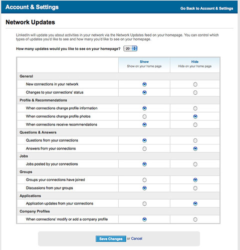
Eventually the ability to turn off notifications to the social tools was added to the Settings page, but there is no notification of that functionality on where the problem exists, the pages where this container shows up (we learned this in software design in the early 90s). Also problematic is the social elements are clustered by task/tool relevance and not person or subject. Including pivots could greatly improve this as well as allow for shifting context by the person using LinkedIn.

LinkedIn Account & Settings Network Updates

Focal prioritization is essential to include in initial planning, as this becomes critical when dealing with the relevance stage or even handling a scaling volume of information. Each person using a service is going to have a slightly different set of priorities for relevance and focus. This is going to require some malleability of the system interface to allow for personal optimization of their relevance and streams.

This is not emergent behavior but the reality of what happens when systems scale. LinkedIn is built “;like a classic chamber meeting where networking is orchestrated”;, as stated by Margaret Rosas. Sadly, LinkedIn is not built for flexibility that is needed as systems scale to or beyond the volume stage. It is built as if this was a surprise, which prior to 18 months ago LinkedIn’s careful approach was much smoother with their growth of features and functionality.

LinkedIn changed its layout and structure of its pages to account for the coming new functionality, which is quite smart. But it did so in a manner that seemed to consider all notifications and functionality should have the same focus.

If you remove notifications, there is no ambient notification to let you know there is really any activity. The front page is part portal and part dashboard, but the distinct concepts around these two approaches seem to have baffled the interaction designers and developers.

LinkedIn: Social Node or Social Hub?

LinkedIn also seems quite schizophrenic as to its social purpose. It has built part of the social framework as if the rest of the web only allowed limited interaction with it, which it would make it just a node on a network. This destination framework does not account for people having any other service that provides social features that could easily be shared in or out.

The other side of LinkedIn is a hub, which information flows though. Inbound status messages from other services show up in LinkedIn’s pages as to the “applications”, but using connecting identity in a manner that permits not having Twitter messages I read elsewhere show up in LinkedIn would be more than helpful (yes, part of this is OAuth, which Twitter and many other have not deemed valuable yet (come on Twitter this is not rocket surgery). The applications and information it allows in is limited to a relatively small number of services. Having a small number of services integrated should allow for contextual relevance of the objects, but that would be assuming again LinkedIn was well thought through. This interaction with services would also benefit form LinkedIn offering OpenID as well as OAuth integration to ease the pain and security.

LinkedIn does not have an open API as of yet (this should have happened when they launched status and some other social elements). The LinkedIn API for status would allow LinkedIn to be a sharing out hub as well as the partially capable in-bound hub it already is. LinkedIn is a business focussed social environment, but has not realized its DNA is business based and there are task flows and workflows to enable that would make a lot of sense.

LinkedIn Forgot the “Me” in Social

All social begins with me. Social interaction is about an individuals intentions, actions, and their activities. What things a person wants to share with others and how interact with is one part of the social framework. Another other is consumption and working with the flows of content generated by others. LinkedIn did a decent job with flow until it started adding the more social features in the last 18 months. What LinkedIn did know (focus and purpose) they now show little grasp of understanding as their features have created more flow and more velocity for the information ebbing through the service with no planning for it. It takes very little understanding of social tools to know that this will likely happen and there are interaction elements that are going to be required to handle this, for example moving things out of the flow.

Many people want to see those they have just connected with, things they just published/shared and responses. There is also the desire to hold on to things that are relevant to the individual. This holding on to things requires a means to favorite or put it in place where things can be collected and worked on later. These things could be single comments in group discussions, people’s names/profiles who are surfacing, notifications, etc.

With the velocity of information increasing in LinkedIn the capability to perform a task and drop back into the flow where you were is gone. Any decent interaction designer for social tools knows this reality and had a stack of solutions to set in place from the outset.

Social Context in Groups

The math of social software for people is the mostly the one-to-one relationships and being able to see those. But, social software occasionally is about communicating to groups.

LinkedIn added group discussions, but did this as if the last 10 to 15 years in forums and groupware platforms never existed. The group discussions are not threaded nor do they offer the option to turn on threading for the discussions (this has been default for off-the-shelf forums for over 8 years at least). Also lacking is the capability to hold on to and collect valuable items found in discussions, let alone a means to personally contextualize them.

Another thing LinkedIn fails to grasp is contextual relationships to people in the discussions. For example, if someone I know has started or commented in a group discussion the service should highlight this. There is a potentially higher social contextual relevance for that piece of information. When information starts turning from a stream into a flood this becomes insanely important.

Once this reality of contextualizing is realized, there are a couple of options that are likely to be needed quite quickly after. One is adding new people in the discussion that we interact with; this context could be surfaced in the discussion or used to augment the rational surfaced in the recommendations.

LinkedIn Georgetown University GroupEmail from groups should not be from the organization name of the group as that looks like it is from the organization. I get official information from organizations, but lacking the understanding of contextual information for e-mail makes an even greater mess of e-mail and group interactions when this is lazily designed. The “from” should begin with LinkedIn group or some other notation.

Context for Events

When LinkedIn added events, I started getting invitations to attend them. But, the wording of the invites made it sound like they were personal invitations, which is not the context they were intended. It took quite a few rather embarrassing e-mails for many events, if they were really requesting my attendance or if it was just an announcement of the event. Understanding a modicum of social interaction and social etiquette would have saved those embarrassing e-mails.

Events also launched with many bugs (many have been ironed out, but most were of the rather blatant variety). One downside of events is there are already an over abundance of event tools, which work rather well (this is a really tough tool set to get right and build). Nearly everybody I talk to has wondered why LinkedIn did not use something like Confabb to license it or buy it (there are many event services available), rather than using their own resources on something that is not up to the level of competing products. Lastly, with regard to events, while the recommendation for connections is good in LinkedIn, the recommendations for events is absolutely horrid. If that is who LinkedIn thinks I am I need a new service now.

Models for Messaging Flows

One of the things that has been flawed in LinkedIn for quite some time is messaging flows. I liked that they pushed messaging out into e-mail and I could respond to a person from my e-mail. One thing that is missing is LinkedIn not updating their messaging flows. Looking in LinkedIn it is quite often impossible to sort out. When I stated I continually have this problem, Jess Leccetti stated, “I’ve had that exact problem! I thought it was my comp being buggy!” Messaging across various media channels is tough and most often fractured. But, when offering a solution it is important to get it right.

Profile Comments Go In...

Finally LinkedIn added the capability to for people using the service to add their own private comments on to other’s profiles. This is a great addition as it allows the means to add context to files. Sadly, it does not seem to surface that information in any other manner other than going to the individual pages.

This lack of functionality outside each profile page is really mind blowing, as it leaves out the capability for using it for tagging, contextual grouping, search aggregation, and use these aggregations for sharing up dates or filtering what is shared. There are emergent activities that could evolve out of these functionalities, but again this seems to not be well thought through.

One approach is a nice simple personal tagging or labeling interaction layer with clickable aggregation interface option. This would allow simply applying glue to personally thread items together through light aggregation. The current comment system only creates islands of context that have chasms between it and other relevant or related items.

Next Steps

LinkedIn needs to get some people in that grasp social interaction design. They purportedly have some, but I am not sure they have influence or the depth of knowledge needed (either is problematic). The LinkedIn service seems to be proof something is horribly wrong along these lines.

LinkedIn also seems to be a victim of not sorting-out what it wants to be. If it wants to be a Facebook for business, the route they are taking is not going to work well for the business users as it is greatly lacking solid functionality and cohesive interaction design with task flows enabled. LinkedIn needs to be LinkedIn and not a Facebook for business.

As many on Twitter have stated, one seemingly viable option is LinkedIn’s social additions of the last 18 months should all be thrown out and simply start over. The only piece that seems to have much positive feedback is the Q&A section, which is not something that I have interest in, but seems to work passably for others.

More coherently, a real reality check is needed at LinkedIn. They must to stop adding features and functionality until they learn to fix what they have added. They need to begin with understanding how social interaction happens, how it scales, and how people need it to work at scale. Stop looking at Facebook for what features to add. LinkedIn has some deep value as a work and business focussed social site, but that is going to require a different focus that what has been applied in the last year to 18 months.

I have deep fear that LinkedIn views what is happening is emergent (emergence happens when things are used in an unpredictable manner: whether wholly unpredictable or unpredictable in that context). What is happening in LinkedIn is not emergent. It is quite predictable: This is what happens at scale with social systems and their information flows.

A grasp of social systems and their uses at various levels of scale (and potential for various interactions and needs) is really needed at LinkedIn. The slowness to act (or, sadly, react as if this was an unknown potential) and fix what they have is not a great sign of encouragement for the organization. Hopefully having Reid Hoffman back as CEO and with Jeff Wiener as President can pull this into focus and set things on a sane path.


Optimizing Tagging UI for People & Search

by Thomas Vander Wal in , , , , , , ,


Overview/Intro

One of my areas of focus is around social tools in the workplace (enterprise 2.0) is social bookmarking. Sadly, is does not have the reach it should as it and wiki (most enterprise focused wikis have collective voice pages (blogs) included now & enterprise blog tools have collaborative document pages (wikis). I focus a lot of my attention these days on what happens inside the organization’s firewall, as that is where their is incredible untapped potential for these tools to make a huge difference.

One of the things I see on a regular basis is tagging interfaces on a wide variety of social tools, not just in social bookmarking. This is good, but also problematic as it leads to a need for a central tagging repository (more on this in a later piece). It is good as emergent and connective tag terms can be used to link items across tools and services, but that requires consistency and identity (identity is a must for tagging on any platform and it is left out of many tagging instances. This greatly decreases the value of tagging - this is also for another piece). There are differences across tools and services, which leads to problems of use and adoption within tools is tagging user interface (UI).

Multi-term Tag Intro

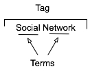
multiterm tag constructionThe multi-term tag is one of the more helpful elements in tagging as it provides the capability to use related terms. These multi-term tags provide depth to understanding when keeping the related tag terms together. But the interfaces for doing this are more complex and confusing than they should be for human, as well as machine consumption.

In the instance illustrated to the tag is comprised or two related terms: social and network. When the tool references the tag, it is looking at both parts as a tag set, which has a distinct meaning. The individual terms can be easily used for searches seeking either of those terms, but knowing the composition of the set, it is relatively easy for the service to offer up "social network" when a person seeks just social or network in a search query.

One common hindrance with social bookmarking adoption is those familiar with it and fans of it for enterprise use point to Delicious, which has a couple huge drawbacks. The compound multi-term tag or disconnected multi-term tags is a deep drawback for most regular potential users (the second is lack of privacy for shared group items). Delicious breaks a basic construct in user focussed design: Tools should embrace human methods of interaction and not humans embracing tech constraints. Delicious is quite popular with those of us malleable in our approach to adopt a technology where we adapt our approach, but that percentage of potential people using the tools is quite thin as a percentage of the population.. Testing this concept takes very little time to prove.

So, what are the options? Glad you asked. But, first a quick additional excursion into why this matters.

Conceptual Models Missing in Social Tool Adoption

One common hinderance for social tool adoption is most people intended to use the tools are missing the conceptual model for what these tools do, the value they offer, and how to personally benefit from these values. There are even change costs involved in moving from a tool that may not work for someone to something that has potential for drastically improved value. The "what it does", "what value it has", and "what situations" are high enough hurdles to cross, but they can be done with some ease by people who have deep knowledge of how to bridge these conceptual model gaps.

What the tools must not do is increase hurdles for adoption by introducing foreign conceptual models into the understanding process. The Delicious model of multi-term tagging adds a very large conceptual barrier for many & it become problematic for even considering adoption. Optimally, Delicious should not be used alone as a means to introduce social bookmarking or tagging.

We must remove the barriers to entry to these powerful offerings as much as we can as designers and developers. We know the value, we know the future, but we need to extend this. It must be done now, as later is too late and these tools will be written off as just as complex and cumbersome as their predecessors.

If you are a buyer of these tools and services, this is you guideline for the minimum of what you should accept. There is much you should not accept. On this front, you need to push back. It is your money you are spending on the products, implementation, and people helping encourage adoption. Not pushing back on what is not acceptable will greatly hinder adoption and increase the costs for more people to ease the change and adoption processes. Both of these costs should not be acceptable to you.

Multi-term Tag UI Options

Compound Terms

I am starting with what we know to be problematic for broad adoption for input. But, compound terms also create problems for search as well as click retrieval. There are two UI interaction patterns that happen with compound multi-term tags. The first is the terms are mashed together as a compound single word, as shown in this example from Delicious.

Tag sample from Delicious

The problem here is the mashing the string of terms "architecture is politics" into one compound term "architectureispolitics". Outside of Germanic languages this is problematic and the compound term makes a quick scan of the terms by a person far more difficult. But it also complicates search as the terms need to be broken down to even have LIKE SQL search options work optimally. The biggest problem is for humans, as this is not natural in most language contexts. A look at misunderstood URLs makes the point easier to understand (Top Ten Worst URLs)

The second is an emergent model for compound multi-term tags is using a term delimiter. These delimiters are often underlines ( _ ), dots ( . ), or hyphens ( - ). A multi-term tag such as "enterprise search" becomes "enterprise.search", "enterprise_search" and "enterprise-search".

While these help visually they are less than optimal for reading. But, algorithmically this initially looks to be a simple solution, but it becomes more problematic. Some tools and services try to normalize the terms to identify similar and relevant items, which requires a little bit of work. The terms can be separated at their delimiters and used as properly separated terms, but since the systems are compound term centric more often than not the terms are compressed and have similar problems to the other approach.

Another reason this is problematic is term delimiters can often have semantic relevance for tribal differentiation. This first surface terms when talking to social computing researchers using Delicious a few years ago. They pointed out that social.network, social_network, and social-network had quite different communities using the tags and often did not agree on underlying foundations for what the term meant. The people in the various communities self identified and stuck to their tribes use of the term differentiated by delimiter.

The discovery that these variations were not fungible was an eye opener and quickly had me looking at other similar situations. I found this was not a one-off situation, but one with a fair amount of occurrence. When removing the delimiters between the terms the technologies removed the capability of understanding human variance and tribes. This method also breaks recommendation systems badly as well as hindering the capability of augmenting serendipity.

So how do these tribes identify without these markers? Often they use additional tags to identity. The social computing researchers add "social computing", marketing types add "marketing", etc. The tools then use their filtering by co-occurrence of tags to surface relevant information (yes, the ability to use co-occurrence is another tool essential). This additional tag addition help improve the service on the whole with disambiguation.

Disconnected Multi-term Tags

The use of distinct and disconnected term tags is often the intent for space delimited sites like Delicious, but the emergent approach of mashing terms together out of need surfaced. Delicious did not intend to create mashed terms or delimited terms, Joshua Schachter created a great tool and the community adapted it to their needs. Tagging services are not new, as they have been around for more than two decades already, but how they are built, used, and platforms are quite different now. The common web interface for tagging has been single terms as tags with many tags applied to an object. What made folksonomy different from previous tagging was the inclusion of identity and a collective (not collaborative) voice that intelligent semantics can be applied to.

The downside of disconnected terms in tagging is certainty of relevance between the terms, which leads to ambiguity. This discussion has been going on for more than a decade and builds upon semantic understanding in natural language processing. Did the tagger intend for a relationship between social & network or not. Tags out of the context of natural language constructs provide difficulties without some other construct for sense making around them. Additionally, the computational power needed to parse and pair potential relevant pairings is somethings that becomes prohibitive at scale.

Quoted Multi-term Tags

One of the methods that surfaced early in tagging interfaces was the quoted multi-term tags. This takes becomes #&039;research "social network" blog' so that the terms social network are bound together in the tool as one tag. The biggest problem is still on the human input side of things as this is yet again not a natural language construct. Systematically the downside is these break along single terms with quotes in many of the systems that have employed this method.

What begins with a simple helpful prompt...:

 SlideShare Tag Input UI

Still often can end up breaking as follows (from SlideShare):

SlideShare quoted multi-term tag parsing

Comma Delimited Tags

Non-space delimiters between tags allows for multi-term tags to exist and with relative ease. Well, that is relative ease for those writing Western European languages that commonly use commas as a string separator. This method allows the system to grasp there are multi-term tags and the humans can input the information in a format that may be natural for them. Using natural language constructs helps provide the ability ease of adoption. It also helps provide a solid base for building a synonym repository in and/or around the tagging tools.

Ma.gnolia comma separated multi-term tag output

While this is not optimal for all people because of variance in language constructs globally, it is a method that works well for a quasi-homogeneous population of people tagging. This also takes out much of the ambiguity computationally for information retrieval, which lowers computational resources needed for discernment.

Text Box Per Tag

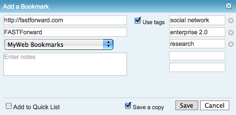
Lastly, the option for input is the text box per tag. This allows for multi-term tags in one text box. Using the tab button on the keyboard after entering a tag the person using this interface will jump down to the next empty text box and have the ability to input a term. I first started seeing this a few years ago in tagging interfaces tools developed in Central Europe and Asia. The Yahoo! Bookmarks 2 UI adopted this in a slightly different implementation than I had seen before, but works much the same (it is shown here).

Yahoo! Bookmarks 2 text box per tag

There are many variations of this type of interface surfacing and are having rather good adoption rates with people unfamiliar to tagging. This approach tied to facets has been deployed in Knowledge Plaza by Whatever s/a and works wonderfully.

All of the benefits of comma delimited multi-term tag interfaces apply, but with the added benefit of having this interface work internationally. International usage not only helps build synonym resources but eases language translation as well, which is particularly helpful for capturing international variance on business or emergent terms.

Summary

This content has come from more than four years of research and discussions with people using tools, both inside enterprise and using consumer web tools. As enterprise moves more quickly toward more cost effective tools for capturing and connecting information, they are aware of not only the value of social tools, but tools that get out the way and allow humans to capture, share, and interact in a manner that is as natural as possible with the tools getting smart, not humans having to adopt technology patterns.


YouTube New Interface and Social Interaction Design Santiy Check

by Thomas Vander Wal in , , , , , ,


YouTube has released a new design for the site and its individual video pages. This gets shared in Google Operating System :: User Inferface Updates at YouTube and TechCrunch :: YouTube Updates Layout, Now with Tabs and Statistics. While the new design looks nice and clean, it has one design bug that is horribly annoying it has mixed interaction design metaphors for its tabs or buttons.

Update: YouTube has changed the "favorite" from a button action to a tab, but they forgot the unfavorite functionality. Once you favorite you can not change your mind. Who is leading these choices that should be well understood? Let's chat, I would love to help.

Broken Interaction Design on Buttons or Tabs

YouTube New Video Interface As the image shows the Share, Favorite, Playlists, and Flag buttons or tabs all have similar design treatment, but they do not have the same actions when you click on them. Three of the items (Share, Playlists, and Flag) all act as tabs that open up a larger area below them to provide more options and information. But, the Favorites acts like a button that when clicked it marks the item as a favorite.

This is incredibly poor interaction design as all the items should act in the same manner. If the items do not have the same action properties they really should not look the same and be in the same action space. Favorites should be a check box or a binary interface for on and off. That interaction patter more closely matches the Rate section and seems like it should have been there rather than showing a lack of understanding interaction design basics and confusing people using the site/service.

Social Sites Seem to Share a Lack of Interaction Understanding

This should have been a no brainer observation for a design manager or somebody with a design sanity check. YouTube is far from the the only site/service doing this. Nearly all of the services are not grasping the basics or are broadly applying design patterns to all user scenarios when they really do not fit all scenarios and user types (nearly every service I talk to know exactly the use type a person fits into but never takes this into account in optimization of design patterns that match that use need). Facebook really falls into this hole badly and never seems to grasp they are really making a mess of things the more features and functionality they are bringing into their service without accounting for the design needs in the interface.

My seemingly favorite site to nit pick is LinkedIn which I use a lot and has been a favorite, but their social interaction additions and interactive interfaces really need much better sanity checks and testing before they go into production (even into the beta interface). LinkedIn is really trying to move forward and they are moving in the right direction, but they really need better design thinking with their new features and functionality. Their new design is ready to handle some of the new features, but the features need a lot more refining. The new design shows they have a really good grasp that the interface needs to be a flexible foundation to be used as a framework for including new features, which could benefit from treating them as options for personalization. LinkedIn has pulled back many of the social features and seems to be rethinking them and refining them, but they really need some good sanity checks before rolling them out again.

Social Interaction in Enterprise Tools

The befuddled interaction understanding is not germane to commercial or consumer public social web sites, but it also plagues tools aimed at the enterprise. This is not overly surprising as many of the social enterprise (enterprise 2.0) tools and services are copying the public web tools and services to a large degree. This is a good thing, as it puts the focus on ease of use, which has been horribly missing in business focussed tools for far too long. But, the down side for enterprise focussed tools is they are not for the public web they are for business users, who most often do not have familiarity with the conventions on the public web and they have a large cognitive gap in understanding what the tools do and their value. There is less time for playing and testing in most business people's worklife. This means the tools need to get things right up front with clear understanding of the use needs of the people they are building for in business. This seems to be lacking in many tools as there is much copying of poor design that really needs to be tested thoroughly before launching. Business focussed tools are not hitting the same people as are on the web, which will work through poor design and functionality to see what things do. It is also important to consider that there are a wide variety of types of people using these tools with varying needs and varying interaction understandings (this will be another blog post, actually a series of posts that relate to things I have been including in workshops the last six months and presenting the last couple).


Denning and Yaholkovsky on Real Collaboration

by Thomas Vander Wal in , , , , , , , ,


The latest edition of the Communications of the ACM (Volume 51, Issue 4 - April 2008) includes an article on Getting to "we", which starts off by pointing out the misuse and mis-understanding of the term collaboration as well as the over use of the practice of collaboration when it is not proper for the need. The authors Peter Denning and Peter Yaholkovsky break down the tools needed for various knowledge needs into four categories: 1) Information sharing; 2) Coordination; 3) Cooperation; and Collaboration. The authors define collaboration as:

Collaboration generally means working together synergistically. If your work requires support and agreement of others before you can take action, you are collaborating.

The article continues on to point out that collaboration is often not the first choice of tools we should reach for, as gathering information, understanding, and working through options is really needed in order to get to the stages of agreement. Their article digs deeply into the resolving "messy problems" through proper collaboration methods. To note, the wiki - the usual darling of collaboration - is included in their "cooperation" examples and not Collaboration. Most of the tools many businesses consider in collaboration tools are in the lowest level, which is "information sharing". But, workflow managment falls into the coordination bucket.

This is one of the better breakdowns of tool sets I have seen. The groupings make a lot of sense and their framing of collaboration to take care of the messiest problems is rather good, but most of the tools and services that are considered to be collaborations tools do not even come close to that description or to the capabilities required.


Understanding Taxonomy and Folksonmy Together

by Thomas Vander Wal in , , , ,


I deeply appreciate Joshua Porter's link to from his Taxonomies and Tags blog post. This is a discussion I have quite regularly as to the relation and it is in my presentations and workshops and much of my tagging (and social web) training, consulting, and advising focusses on getting smart on understanding the value and downfalls of folksonomy tagging (as well as traditional tagging - remember tagging has been around in commercial products since at least the 1980s). The following is my response in the comments to Josh' post...

Response to Taxonomy and Tags

Josh, thanks for the link. If the world of language were only this simple that this worked consistently. The folksonomy is a killer resource, but it lacks structure, which it crucial to disambiguating terms. There are algorithmic ways of getting close to this end, but they are insanely processor intensive (think days or weeks to churn out this structure). Working from a simple flat taxonomy or faceted system structure can be enabled for a folksonomy to adhere to.
This approach can help augment tags to objects, but it is not great at finding objects by tags as Apple would surface thousands of results and they would need to be narrowed greatly to find what one is seeking.
There was an insanely brilliant tool, RawSugar [(now gone thanks to venture capitalists pulling the plug on a one of a kind product that would be killer in the enterprise market)], that married taxonomy and folksonomy to help derive disambiguation (take appleseed as a tag, to you mean Johnny Appleseed, appleseed as it relates to gardening/farming, cooking, or the anime movie. The folksonomy can help decipher this through co-occurrence of terms, but a smart interface and system is needed to do this. Fortunately the type of system that is needed to do this is something we have, it is a taxonomy. Using a taxonomy will save processor time, and human time through creating an efficient structure.
Recently I have been approached by a small number of companies who implemented social bookmarking tools to develop a folksonomy and found the folksonomy was [initially] far more helpful than they had ever imagined and out paced their taxonomy-based tools by leaps and bounds (mostly because they did not have time or resources to implement an exhaustive taxonomy (I have yet to find an organization that has an exhaustive and emergent taxonomy)). The organizations either let their taxonomist go or did not replace them when they left as they seemed to think they did not need them with the folksonomy running. All was well and good for a while, but as the folksonomy grew the ability to find specific items decreased (it still worked fantastically for people refinding information they had personally tagged). These companies asked, "what tools they would need to start clearing this up?" The answer a person who understands information structure for ease of finding, which is often a taxonomist, and a tool that can aid in information structure, which is often a taxonomy tool.
The folksonomy does many things that are difficult and very costly to do in taxonomies. But taxonomies do things that folksonomies are rather poor at doing. Both need each other.

Complexity Increases as Folksonomies Grow

I am continually finding organizations are thinking the social bookmarking tools and folksonomy are going to be simple and a cure all, but it is much more complicated than that. The social bookmarking tools will really sing for a while, but then things need help and most of the tools out there are not to the point of providing that assistance yet. There are whole toolsets missing for monitoring and analyzing the collective folksonomy. There is also a need for a really good disambiguation tool and approach (particularly now that RawSugar is gone as a viable approach).


Stitching Conversation Threads Fractured Across Channels

by Thomas Vander Wal in , , , , , , , , , , , ,


Communicating is simple. Well it is simple at its core of one person talking with another person face-to-face. When we communicate and add technology into the mix (phone, video-chat, text message, etc.) it becomes more difficult. Technology becomes noise in the pure flow of communication.

Now With More Complexity

But, what we have today is even more complex and difficult as we are often holding conversation across many of these technologies. The communication streams (the back and forth communication between two or more people) are now often not contained in on communication channel (channel is the flavor or medium used to communicate, such as AIM, SMS, Twitter, e-mail, mobile phone, etc.).

We are seeing our communications move across channels, which can be good as this is fluid and keeping with our digital presence. More often than not we are seeing our communication streams fracture across channels. This fracturing becomes really apparent when we are trying to reconstruct our communication stream. I am finding this fracturing and attempting to stitch the stream back together becoming more and more common as for those who are moving into and across many applications and devices with their own messaging systems.

The communication streams fracture as we pick-up an idea or need from Twitter, then direct respond in Twitter that moves it to SMS, the SMS text message is responded back to in regular SMS outside of Twitter, a few volleys back and forth in SMS text, then one person leaves a voicemail, it is responded to in an e-mail, there are two responses back and forth in e-mail, an hour later both people are on Skype and chat there, in Skype chat they decide to meet in person.

Why Do We Want to Stitch the Communication Stream Together?

When they meet there is a little confusion over there being no written overview and guide. Both parties are sure they talked about it, but have different understandings of what was agreed upon. Having the communication fractured across channels makes reconstruction of the conversation problematic today. The conversation needs to be stitched back together using time stamps to reconstruct everything [the misunderstanding revolved around recommendations as one person understands that to mean a written document and the other it does not mean that].

Increasingly the reality of our personal and professional lives is this cross channel communication stream. Some want to limit the problem by keeping to just one channel through the process. While this is well intentioned it does not meet reality of today. Increasingly, the informal networking leads to meaningful conversations, but the conversations drifts across channels and mediums. Pushing a natural flow, as it currently stands, does not seem to be the best solution in the long run.

Why Does Conversation Drift Across Channels?

There are a few reasons conversations drift across channels and mediums. One reason is presence as when two people notice proximity on a channel they will use that channel to communicate. When a person is seen as present, by availability or recently posting a message in the service, it can be a prompt to communicate. Many times when the conversation starts in a presence channel it will move to another channel or medium. This shift can be driven by personal preference or putting the conversation in a medium or channel that is more conducive for the conversation style between people involved. Some people have a preferred medium for all their conversations, such as text messaging (SMS), e-mail, voice on phone, video chat, IM, etc.. While other people have a preferred medium for certain types of conversation, like quick and short questions on SMS, long single responses in e-mail, and extended conversations in IM. Some people prefer to keep their short messages in the channel where they begin, such as conversations that start in Facebook may stay there. While other people do not pay attention to message or conversation length and prefer conversations in one channel over others.

Solving the Fractured Communication Across Channels

Since there are more than a few reasons for the fractured communications to occur it is something that needs resolution. One solution is making all conversations open and use public APIs for the tools to pull the conversations together. This may be the quickest means to get to capturing and stitching the conversation thread back together today. While viable there are many conversations in our lives that we do not want public for one reason or many.

Another solution is to try to keep your conversations in channels that we can capture for our own use (optimally this should be easily sharable with the person we had the conversation with, while still remaining private). This may be where we should be heading in the near future. Tools like Twitter have become a bridge between web and SMS, which allows us to capture SMS conversations in an interface that can be easily pointed to and stitched back together with other parts of a conversation. E-mail is relatively easy to thread, if done in a web interface and/or with some tagging to pull pieces in from across different e-mail addresses. Skype chat also allows for SMS interactions and allows for them to be captured, searched, and pulled back together. IM conversations can easily be saved out and often each item is time stamped for easy stitching. VoIP conversations are often easily recorded (we are asking permission first, right?) and can be transcribed by hand accurately or be transcribed relatively accurately via speech-to-text tools. Voice-mail can now be captured and threaded using speech-to-text services or even is pushed as an attachment into e-mail in services as (and similar to) JConnect.

Who Will Make This Effortless?

There are three types of service that are or should be building this stitching together the fractured communications across channels into one threaded stream. I see tools that are already stitching out public (or partially public) lifestreams into one flow as one player in this pre-emergent market (Facebook, Jaiku, etc.). The other public player would be telecoms (or network provider) companies providing this as a service as they currently are providing some of these services, but as their markets get lost to VoIP, e-mail, on-line community messaging, Second Life, etc., they need to provide a service that keeps them viable (regulation is not a viable solution in the long run). Lastly, for those that do not trust or want their conversation streams in others hands the personally controlled application will become a solutions, it seems that Skype could be on its way to providing this.

Is There Demand Yet?

I am regularly fielding questions along these lines from enterprise as they are trying to deal with these issues for employees who have lost or can not put their hands on vital customer conversations or essential bits of information that can make the difference in delivering what their customers expect from them. Many have been using Cisco networking solutions that have some of these capabilities, but still not providing a catch all. I am getting queries from various telecom companies as they see reflections of where they would like to be providing tools in a Come to Me Web or facilitating bits of the Personal InfoCloud. I am getting requests from many professionals that want this type of solution for their lives. I am also getting queries from many who are considering building these tools, or pieces of them.

Some of us need these solutions now. Nearly all of us will need these solutions in the very near future.